Data Collection
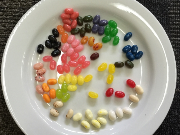
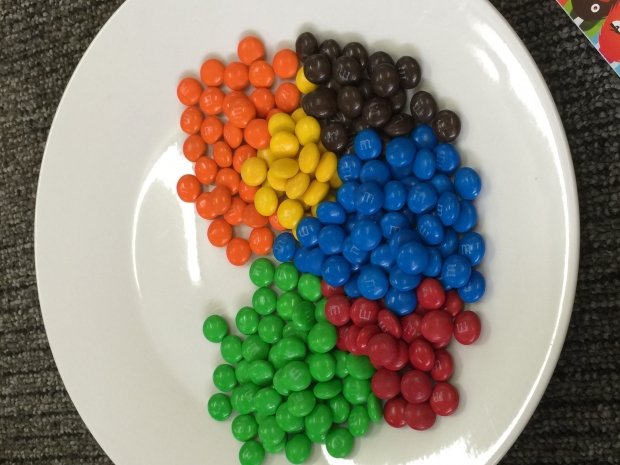
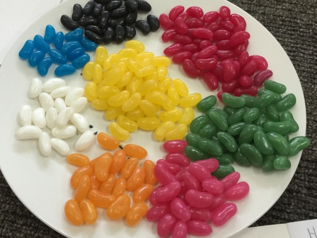
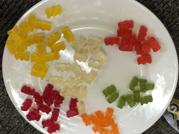
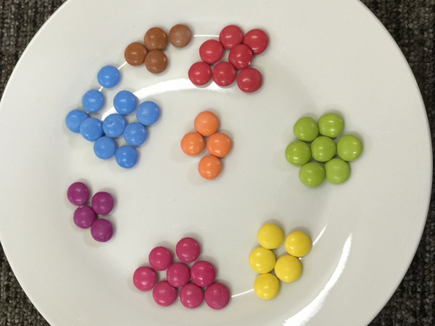
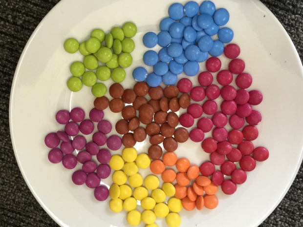
Have you every wondered if you are getting a fair share of your favourite lollies?
Well the children at Olinda have done some sweet data analysis of different bags of lollies.
The children created their tally charts, then transferred the information into bar graphs. Some children even created a pie graph.
Look at the two different sized packets of smarties. Do you think the blue is the most frequent colour?
We will scan their graphs next week.